The 1961 JSM definitives in 2 types of design!

Discusiones, consultas e información sobre las Series Próceres y Riquezas II y III
Responder
Avatar de Usuario
Rein
Usuario Colaborador
Usuario Colaborador
Mensajes: 6258
Registrado: 13 Mar 2009 15:59
Ubicación: Leiden, Netherlands
Contactar:

The 1961 JSM definitives in 2 types of design!

Mensaje por Rein »

The JSM set has - apart from the division in offset-litho and typography - another option of division!

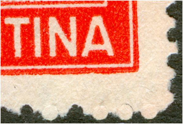
Having a good look at the inscription "Argentina" the distance between the country name and the white horizontal bar is either large or small. All the offset-litho printings [2, 4, 8, 10p and 2, 4, 8, 10, 20p with S.O.] have the larger distance. The typography stamps of the 8, 10 and 20p also have the larger distance.

Imagen

Just an aside that I have mentioned in another thread: the 20p in offset-litho without the S.O. does NOT exist.

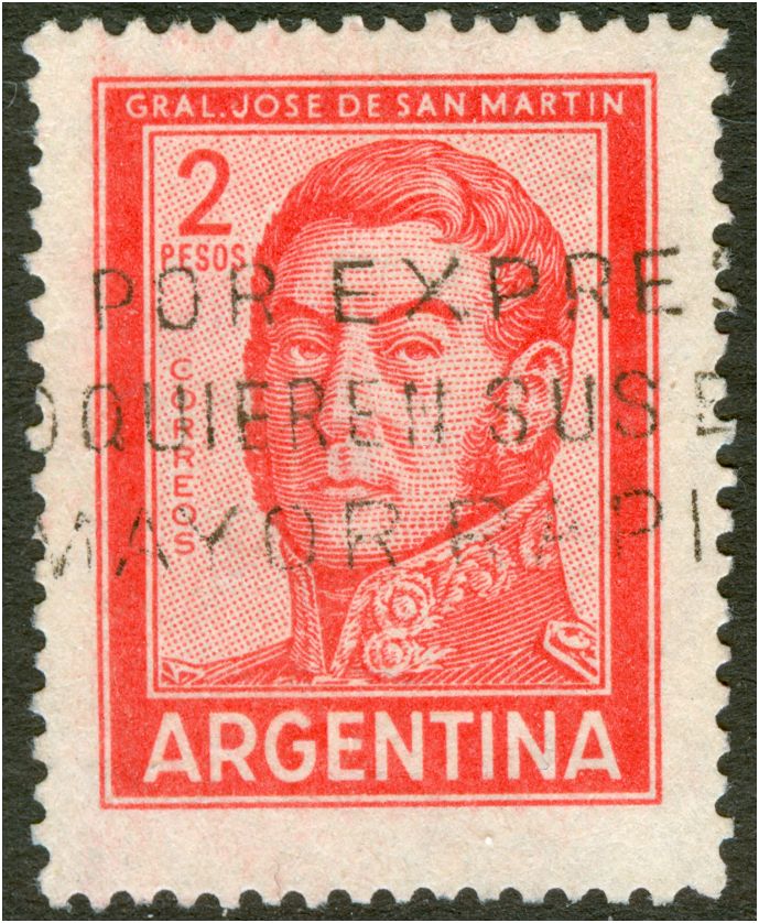
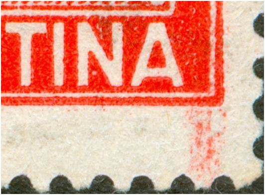
The 2p has a larger AND a smaller distance in the typography stamps:
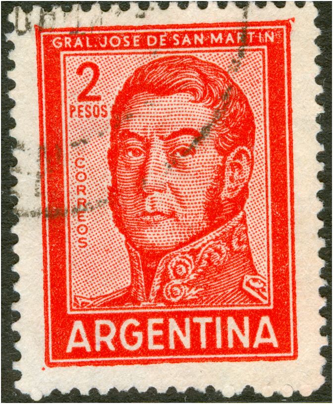
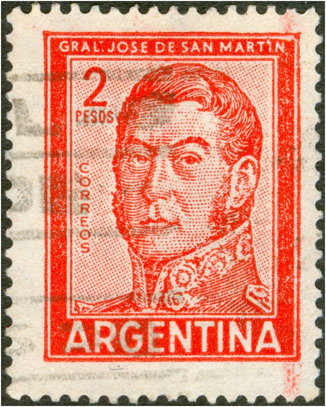
Imagen

Imagen

or in detail:

Imagen

Imagen

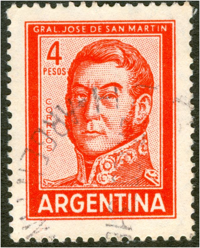
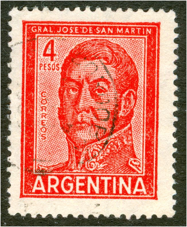
the 4p in offset-litho has the larger distance, the 4p in typography has the smaller distance:

Imagen

Imagen


to be continued....
Avatar de Usuario
zakur
Usuario Colaborador
Usuario Colaborador
Mensajes: 2489
Registrado: 17 Sep 2007 11:21
Contactar:

Re: The 1961 JSM definitives in 2 types of design!

Mensaje por zakur »

Really amazing...
Thats why i really like definitives, you can always find new stuff.
www.albumdeestampillas.com.ar
albumdeestampillas.blogspot.com
Avatar de Usuario
Rein
Usuario Colaborador
Usuario Colaborador
Mensajes: 6258
Registrado: 13 Mar 2009 15:59
Ubicación: Leiden, Netherlands
Contactar:

Re: The 1961 JSM definitives in 2 types of design!

Mensaje por Rein »

Just reading posts about the 2p cara rayada I found a note by J.M. Merlo mentioning the change of lettering of "Argentina" !

http://www.filateliaargentina.com.ar/fo ... yada#p4424

'"No olvidar tampoco que los sellos 604B y 604Ba fueron puestos en circulacion el mismo dia, es decir el 1/7/1961 (tengo los sobres 1° dia de circulacion).
Cuando digo que de un mismo diseño primitivo nacieron tres sellos debo aclarar que dichos sellos son los mencionados 604B, 604Ba y tambien el cara rayada, aunque este catalogado como una variedad del 604C. Esto no es corresto pues el catalogo al decir (604) "a id. cara rayada en vez de punteada" expresa que sus medidas son iguales a las del 604C y no es asi pues no mide 19,5 x 25 mm sino 19,5 x 26 mm, es decir la medida del 604Ba. El 604C no solo es un tipografiado, por lo dicho 1 mm mas corto que el 604Ba sino que cambia el diseño original al agrandar las letras ARGENTINA de tal modo que estas casi tocan las lineas del recuadro y el marco, cosa que no lo hacen los retantes sellos 604. "
Avatar de Usuario
Rein
Usuario Colaborador
Usuario Colaborador
Mensajes: 6258
Registrado: 13 Mar 2009 15:59
Ubicación: Leiden, Netherlands
Contactar:

Re: The 1961 JSM definitives in 2 types of design!

Mensaje por Rein »

zakur escribió:Really amazing...
Thats why i really like definitives, you can always find new stuff.
It often occurs that small changes of design in a definitive were made, but they also often get completely overlooked. So even though millions may have been printed, only a few copies may be found later - at least mint copies! And used copies may be hard as well to find.

Another problem is that in philatelic publications the "discoverer" may have told the community that the new variant had been found, but usually the stamp dealers and catalogue publishers did not care a bit! For them a value of 0.20 or 0.50 is not worth the trouble of sorting their stock so they won't bother to mention it in their catalogue.

The current 0.39 Queen Beatrix stamps of the Netherlands exists in at least 3 different types - easy to recognize - but the Stamp Dealers Association in the Nethelrands - mentions only one type!

In this case it is quite likely that J. M. Merlo has described the 2 types of the 2p JSM, but that the catalogue makers are not interested. They certainly will not bother to publish a good picture that might have helped a lot of collectors - see the 20c G. Brown.
Avatar de Usuario
Rein
Usuario Colaborador
Usuario Colaborador
Mensajes: 6258
Registrado: 13 Mar 2009 15:59
Ubicación: Leiden, Netherlands
Contactar:

Re: The 1961 JSM definitives in 2 types of design!

Mensaje por Rein »

J.M. Merlo seems to state that there were 2 designs originally - cara rayado and cara punctado - but that the first got discontinued. A 3rd design was introduced as well but only for the typographed stamps.

Why should the 2nd design have been used for all the other values as well - both offset-litho and typography? And the 3rd design - apart from the 2p - only for the 4p in typogrqphy???

And why is there a difference in design between the offset-litho versions and the typographed ones??? Not just for the 2p but for all values!

The typography stamps had been printed on the Goebel rotary - an old press by that time - the printed results are horrible. Outside the very design ink may find its way everywhere. Measuring the stamp is no sinecure as you hardly can tell where the design stops.

Maybe J.M. Merlo can explain someday why the Casa de Moneda made such a mess out of an otherwise pretty good printing method that typography is!
Avatar de Usuario
dmargaritini
Usuario Verificado
Usuario Verificado
Mensajes: 152
Registrado: 10 Ago 2007 23:36
Ubicación: CRUZ ALTA - CORDOBA

Re: The 1961 JSM definitives in 2 types of design!

Mensaje por dmargaritini »

PREGUNTA - Existe un 4p cara rayada, estoy biendo en mercado libre una oferta con dicho sello, de parte mia no sabia, es real???????

atte.Daniel.......................
patagonian

Re: The 1961 JSM definitives in 2 types of design!

Mensaje por patagonian »

ATENCIÓN esto es una estafa, sigo el tema en un nuevo post con el tuyo como origen, la cosa es muy seria.:

http://www.filateliaargentina.com.ar/fo ... f=6&t=1865

Responder

Volver a “"Próceres y Riquezas" II y III”